> ## Documentation Index
> Fetch the complete documentation index at: https://docs.cedarcopilot.com/llms.txt
> Use this file to discover all available pages before exploring further.
# Radial Menu Spell
> A circular context menu that appears around the cursor for quick actions
# Radial Menu Spell
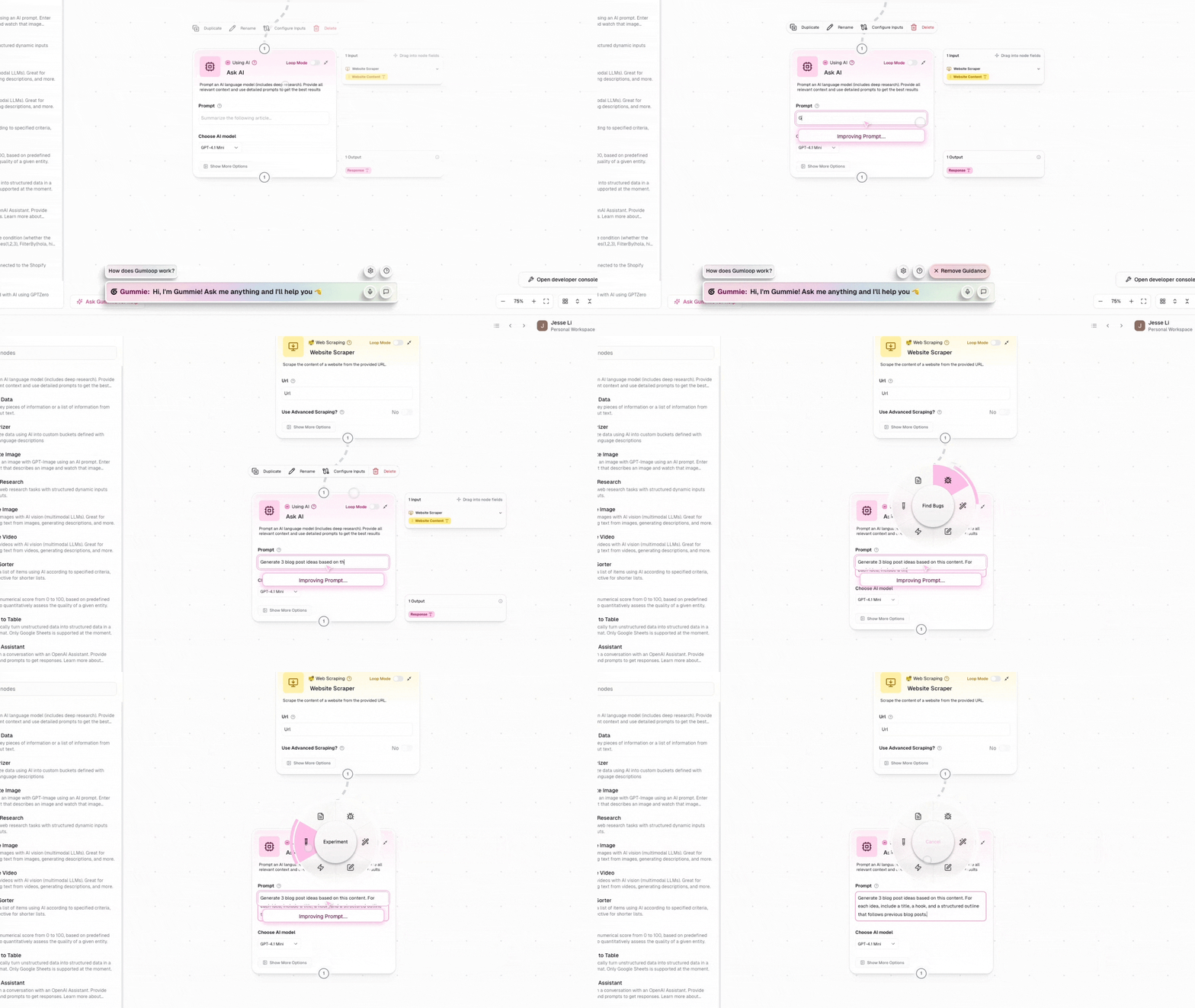
The `RadialMenuSpell` component creates a beautiful circular menu that appears at the cursor position, perfect for providing quick contextual actions. It features smooth animations, visual feedback, and supports both keyboard and mouse activation.
 ## Features
* **Circular Layout**: Items arranged in a circle for equal access
* **Visual Feedback**: Animated hover states and selection indicators
* **Cancel Zone**: Center area for canceling without action
* **Flexible Activation**: Supports keyboard shortcuts and mouse events
* **Hold-to-Select**: Natural interaction pattern for quick actions
* **Escape Support**: Press ESC to cancel without executing
* **Theme Integration**: Adapts to Cedar's light/dark mode
* **Icon Support**: Use emojis or Lucide icons for menu items
## Installation
```tsx theme={null}
import { RadialMenuSpell } from 'cedar-os-components/spells';
```
## Basic Usage
```tsx theme={null}
import {
RadialMenuSpell,
type RadialMenuItem,
} from 'cedar-os-components/spells';
import { MouseEvent, ActivationMode } from 'cedar-os';
import { Copy, Trash, Edit, Share } from 'lucide-react';
function MyComponent() {
const menuItems: RadialMenuItem[] = [
{
title: 'Copy',
icon: Copy,
onInvoke: (store) => {
// Access Cedar store for actions
console.log('Copy action');
},
},
{
title: 'Edit',
icon: Edit,
onInvoke: (store) => {
console.log('Edit action');
},
},
{
title: 'Share',
icon: Share,
onInvoke: (store) => {
console.log('Share action');
},
},
{
title: 'Delete',
icon: Trash,
onInvoke: (store) => {
console.log('Delete action');
},
},
];
return (
);
}
```
## Props
### RadialMenuSpell Props
| Prop | Type | Required | Description |
| ---------------------- | ---------------------- | -------- | ----------------------------------------- |
| `spellId` | `string` | Yes | Unique identifier for this spell instance |
| `items` | `RadialMenuItem[]` | Yes | Array of menu items to display |
| `activationConditions` | `ActivationConditions` | Yes | Conditions that trigger the menu |
### RadialMenuItem Interface
```tsx theme={null}
interface RadialMenuItem {
/** Display title (shown in center on hover) */
title: string;
/** Emoji string or Lucide icon component */
icon: string | LucideIcon;
/** Callback when item is selected */
onInvoke: (store: CedarStore) => void;
}
```
## Activation Patterns
### Hold Pattern (Recommended)
The most natural interaction for radial menus is the hold pattern:
```tsx theme={null}
activationConditions={{
events: [MouseEvent.RIGHT_CLICK],
mode: ActivationMode.HOLD
}}
```
**User flow:**
1. Right-click and hold to open menu
2. Move mouse to desired item (it highlights)
3. Release to execute action
4. Or move to center and release to cancel
### Toggle Pattern
For persistent menus that stay open:
```tsx theme={null}
activationConditions={{
events: [Hotkey.SPACE],
mode: ActivationMode.TOGGLE
}}
```
**User flow:**
1. Press Space to open menu
2. Move mouse to select item
3. Click to execute or press Space again to close
### Keyboard Shortcut
Bind to any keyboard shortcut:
```tsx theme={null}
activationConditions={{
events: ['ctrl+e', 'cmd+e'],
mode: ActivationMode.HOLD
}}
```
## Advanced Examples
### AI Actions Menu
Create an AI-powered context menu:
```tsx theme={null}
import { Sparkles, Brain, Wand2, Zap } from 'lucide-react';
const aiMenuItems: RadialMenuItem[] = [
{
title: 'Explain',
icon: Brain,
onInvoke: async (store) => {
const selection = window.getSelection()?.toString();
if (selection) {
await store.sendMessage({
content: `Explain this: ${selection}`,
role: 'user',
});
}
},
},
{
title: 'Improve',
icon: Sparkles,
onInvoke: async (store) => {
const selection = window.getSelection()?.toString();
if (selection) {
await store.sendMessage({
content: `Improve this text: ${selection}`,
role: 'user',
});
}
},
},
{
title: 'Summarize',
icon: Zap,
onInvoke: async (store) => {
await store.sendMessage({
content: 'Summarize the current conversation',
role: 'user',
});
},
},
{
title: 'Generate',
icon: Wand2,
onInvoke: (store) => {
// Open generation dialog
store.setSpellActive('generation-dialog', true);
},
},
];
```
### Emoji-Based Menu
Use emojis for a playful interface:
```tsx theme={null}
const emojiMenuItems: RadialMenuItem[] = [
{
title: 'Love it!',
icon: '❤️',
onInvoke: (store) => {
// Add reaction
},
},
{
title: 'Celebrate',
icon: '🎉',
onInvoke: (store) => {
// Trigger celebration
},
},
{
title: 'Question',
icon: '❓',
onInvoke: (store) => {
// Ask for clarification
},
},
{
title: 'Bookmark',
icon: '📌',
onInvoke: (store) => {
// Save for later
},
},
];
```
### Dynamic Menu Items
Generate menu items based on context:
```tsx theme={null}
function ContextualRadialMenu({ selectedElement }) {
const menuItems = useMemo(() => {
const items: RadialMenuItem[] = [];
if (selectedElement?.type === 'image') {
items.push({
title: 'Download',
icon: Download,
onInvoke: () => downloadImage(selectedElement),
});
items.push({
title: 'Edit',
icon: Edit,
onInvoke: () => openImageEditor(selectedElement),
});
}
if (selectedElement?.type === 'text') {
items.push({
title: 'Copy',
icon: Copy,
onInvoke: () => copyToClipboard(selectedElement.content),
});
}
// Add common items
items.push({
title: 'Share',
icon: Share,
onInvoke: () => shareContent(selectedElement),
});
return items;
}, [selectedElement]);
return (
);
}
```
## Visual Customization
The radial menu automatically adapts to Cedar's styling system:
### Theme Integration
The component uses Cedar's styling context:
* **Brand Color**: Used for hover states and selection
* **Dark Mode**: Automatically adjusts colors and contrasts
* **Text Colors**: Adapts based on theme
### Layout Constants
The component uses these layout constants (defined in the component):
```tsx theme={null}
const MENU_RADIUS = 100; // Radius of the menu circle
const INNER_RADIUS = 50; // Cancel zone radius
const INNER_GAP = 4; // Gap between zones
const OUTER_PADDING = 10; // Outer padding
const BORDER_STROKE_WIDTH = 8; // Ring thickness
```
## Interaction Details
### Mouse Behavior
* **Hover**: Moving mouse over items highlights them
* **Center Zone**: Moving to center shows "Cancel"
* **Selection**: Release (hold mode) or click (toggle mode) to select
* **Visual Feedback**: Animated ring shows current selection
### Keyboard Support
* **ESC**: Cancel without executing any action
* **Activation Keys**: Defined by `activationConditions`
### Position Handling
* **Mouse Events**: Menu appears at cursor position
* **Keyboard Events**: Menu appears at viewport center
* **Smart Positioning**: Stays within viewport bounds
## Best Practices
### 1. Limit Item Count
Keep menus focused with 3-8 items:
```tsx theme={null}
// ✅ Good: Focused set of actions
const items = [
{ title: 'Edit', icon: Edit, onInvoke: handleEdit },
{ title: 'Share', icon: Share, onInvoke: handleShare },
{ title: 'Delete', icon: Trash, onInvoke: handleDelete },
];
// ❌ Avoid: Too many items
const items = [
/* 12+ items */
]; // Hard to navigate quickly
```
### 2. Use Clear Icons
Choose recognizable icons:
```tsx theme={null}
// ✅ Good: Clear, standard icons
{
icon: Copy;
} // Universal copy icon
{
icon: '📋';
} // Clear emoji
// ❌ Avoid: Ambiguous icons
{
icon: Circle;
} // What does this do?
{
icon: '🔮';
} // Unclear meaning
```
### 3. Consistent Actions
Keep `onInvoke` callbacks focused:
```tsx theme={null}
// ✅ Good: Single responsibility
onInvoke: (store) => {
const data = prepareData();
store.sendMessage({ content: data, role: 'user' });
};
// ❌ Avoid: Multiple unrelated actions
onInvoke: (store) => {
updateUI();
saveToDatabase();
sendAnalytics();
showNotification();
};
```
### 4. Handle Errors Gracefully
```tsx theme={null}
onInvoke: async (store) => {
try {
await performAction();
} catch (error) {
store.addMessage({
content: 'Action failed. Please try again.',
role: 'system',
});
}
};
```
## Accessibility Considerations
While the radial menu is primarily a visual component, consider these accessibility aspects:
1. **Alternative Activation**: Provide keyboard shortcuts as alternatives
2. **Clear Labels**: Use descriptive titles for screen readers
3. **Escape Route**: Always allow ESC key to cancel
4. **Visual Contrast**: The component respects Cedar's theme for proper contrast
## Performance Notes
* **Singleton Management**: Uses Cedar's spell system for efficient event handling
* **Animation Performance**: Uses CSS transforms for smooth animations
* **Memory Efficient**: Automatically cleaned up when component unmounts
* **Event Delegation**: Single set of listeners for all instances
## Common Patterns
### Tool Selection Menu
```tsx theme={null}
const tools = [
{ title: 'Select', icon: MousePointer },
{ title: 'Draw', icon: Pencil },
{ title: 'Erase', icon: Eraser },
{ title: 'Text', icon: Type },
];
```
### Navigation Menu
```tsx theme={null}
const navigation = [
{ title: 'Home', icon: Home },
{ title: 'Search', icon: Search },
{ title: 'Settings', icon: Settings },
{ title: 'Profile', icon: User },
];
```
### Media Controls
```tsx theme={null}
const mediaControls = [
{ title: 'Play', icon: Play },
{ title: 'Pause', icon: Pause },
{ title: 'Next', icon: SkipForward },
{ title: 'Previous', icon: SkipBack },
];
```
## Troubleshooting
### Menu doesn't appear
* Check that the spell ID is unique
* Verify activation conditions are correct
* Ensure component is mounted
### Items not executing
* Verify `onInvoke` callbacks are defined
* Check for errors in callback functions
* Ensure Cedar store is accessible
### Visual issues
* Component adapts to Cedar's theme automatically
* Check that Cedar styling context is provided
* Verify Container3D component is available
## Related Components
* [TooltipMenuSpell](/spells/tooltip-menu) - Linear menu for text selections
* [QuestioningSpell](/spells/questioning-spell) - Interactive cursor for exploration
* [Creating Custom Spells](/spells/creating-custom-spells) - Build your own spell components
## Features
* **Circular Layout**: Items arranged in a circle for equal access
* **Visual Feedback**: Animated hover states and selection indicators
* **Cancel Zone**: Center area for canceling without action
* **Flexible Activation**: Supports keyboard shortcuts and mouse events
* **Hold-to-Select**: Natural interaction pattern for quick actions
* **Escape Support**: Press ESC to cancel without executing
* **Theme Integration**: Adapts to Cedar's light/dark mode
* **Icon Support**: Use emojis or Lucide icons for menu items
## Installation
```tsx theme={null}
import { RadialMenuSpell } from 'cedar-os-components/spells';
```
## Basic Usage
```tsx theme={null}
import {
RadialMenuSpell,
type RadialMenuItem,
} from 'cedar-os-components/spells';
import { MouseEvent, ActivationMode } from 'cedar-os';
import { Copy, Trash, Edit, Share } from 'lucide-react';
function MyComponent() {
const menuItems: RadialMenuItem[] = [
{
title: 'Copy',
icon: Copy,
onInvoke: (store) => {
// Access Cedar store for actions
console.log('Copy action');
},
},
{
title: 'Edit',
icon: Edit,
onInvoke: (store) => {
console.log('Edit action');
},
},
{
title: 'Share',
icon: Share,
onInvoke: (store) => {
console.log('Share action');
},
},
{
title: 'Delete',
icon: Trash,
onInvoke: (store) => {
console.log('Delete action');
},
},
];
return (
);
}
```
## Props
### RadialMenuSpell Props
| Prop | Type | Required | Description |
| ---------------------- | ---------------------- | -------- | ----------------------------------------- |
| `spellId` | `string` | Yes | Unique identifier for this spell instance |
| `items` | `RadialMenuItem[]` | Yes | Array of menu items to display |
| `activationConditions` | `ActivationConditions` | Yes | Conditions that trigger the menu |
### RadialMenuItem Interface
```tsx theme={null}
interface RadialMenuItem {
/** Display title (shown in center on hover) */
title: string;
/** Emoji string or Lucide icon component */
icon: string | LucideIcon;
/** Callback when item is selected */
onInvoke: (store: CedarStore) => void;
}
```
## Activation Patterns
### Hold Pattern (Recommended)
The most natural interaction for radial menus is the hold pattern:
```tsx theme={null}
activationConditions={{
events: [MouseEvent.RIGHT_CLICK],
mode: ActivationMode.HOLD
}}
```
**User flow:**
1. Right-click and hold to open menu
2. Move mouse to desired item (it highlights)
3. Release to execute action
4. Or move to center and release to cancel
### Toggle Pattern
For persistent menus that stay open:
```tsx theme={null}
activationConditions={{
events: [Hotkey.SPACE],
mode: ActivationMode.TOGGLE
}}
```
**User flow:**
1. Press Space to open menu
2. Move mouse to select item
3. Click to execute or press Space again to close
### Keyboard Shortcut
Bind to any keyboard shortcut:
```tsx theme={null}
activationConditions={{
events: ['ctrl+e', 'cmd+e'],
mode: ActivationMode.HOLD
}}
```
## Advanced Examples
### AI Actions Menu
Create an AI-powered context menu:
```tsx theme={null}
import { Sparkles, Brain, Wand2, Zap } from 'lucide-react';
const aiMenuItems: RadialMenuItem[] = [
{
title: 'Explain',
icon: Brain,
onInvoke: async (store) => {
const selection = window.getSelection()?.toString();
if (selection) {
await store.sendMessage({
content: `Explain this: ${selection}`,
role: 'user',
});
}
},
},
{
title: 'Improve',
icon: Sparkles,
onInvoke: async (store) => {
const selection = window.getSelection()?.toString();
if (selection) {
await store.sendMessage({
content: `Improve this text: ${selection}`,
role: 'user',
});
}
},
},
{
title: 'Summarize',
icon: Zap,
onInvoke: async (store) => {
await store.sendMessage({
content: 'Summarize the current conversation',
role: 'user',
});
},
},
{
title: 'Generate',
icon: Wand2,
onInvoke: (store) => {
// Open generation dialog
store.setSpellActive('generation-dialog', true);
},
},
];
```
### Emoji-Based Menu
Use emojis for a playful interface:
```tsx theme={null}
const emojiMenuItems: RadialMenuItem[] = [
{
title: 'Love it!',
icon: '❤️',
onInvoke: (store) => {
// Add reaction
},
},
{
title: 'Celebrate',
icon: '🎉',
onInvoke: (store) => {
// Trigger celebration
},
},
{
title: 'Question',
icon: '❓',
onInvoke: (store) => {
// Ask for clarification
},
},
{
title: 'Bookmark',
icon: '📌',
onInvoke: (store) => {
// Save for later
},
},
];
```
### Dynamic Menu Items
Generate menu items based on context:
```tsx theme={null}
function ContextualRadialMenu({ selectedElement }) {
const menuItems = useMemo(() => {
const items: RadialMenuItem[] = [];
if (selectedElement?.type === 'image') {
items.push({
title: 'Download',
icon: Download,
onInvoke: () => downloadImage(selectedElement),
});
items.push({
title: 'Edit',
icon: Edit,
onInvoke: () => openImageEditor(selectedElement),
});
}
if (selectedElement?.type === 'text') {
items.push({
title: 'Copy',
icon: Copy,
onInvoke: () => copyToClipboard(selectedElement.content),
});
}
// Add common items
items.push({
title: 'Share',
icon: Share,
onInvoke: () => shareContent(selectedElement),
});
return items;
}, [selectedElement]);
return (
);
}
```
## Visual Customization
The radial menu automatically adapts to Cedar's styling system:
### Theme Integration
The component uses Cedar's styling context:
* **Brand Color**: Used for hover states and selection
* **Dark Mode**: Automatically adjusts colors and contrasts
* **Text Colors**: Adapts based on theme
### Layout Constants
The component uses these layout constants (defined in the component):
```tsx theme={null}
const MENU_RADIUS = 100; // Radius of the menu circle
const INNER_RADIUS = 50; // Cancel zone radius
const INNER_GAP = 4; // Gap between zones
const OUTER_PADDING = 10; // Outer padding
const BORDER_STROKE_WIDTH = 8; // Ring thickness
```
## Interaction Details
### Mouse Behavior
* **Hover**: Moving mouse over items highlights them
* **Center Zone**: Moving to center shows "Cancel"
* **Selection**: Release (hold mode) or click (toggle mode) to select
* **Visual Feedback**: Animated ring shows current selection
### Keyboard Support
* **ESC**: Cancel without executing any action
* **Activation Keys**: Defined by `activationConditions`
### Position Handling
* **Mouse Events**: Menu appears at cursor position
* **Keyboard Events**: Menu appears at viewport center
* **Smart Positioning**: Stays within viewport bounds
## Best Practices
### 1. Limit Item Count
Keep menus focused with 3-8 items:
```tsx theme={null}
// ✅ Good: Focused set of actions
const items = [
{ title: 'Edit', icon: Edit, onInvoke: handleEdit },
{ title: 'Share', icon: Share, onInvoke: handleShare },
{ title: 'Delete', icon: Trash, onInvoke: handleDelete },
];
// ❌ Avoid: Too many items
const items = [
/* 12+ items */
]; // Hard to navigate quickly
```
### 2. Use Clear Icons
Choose recognizable icons:
```tsx theme={null}
// ✅ Good: Clear, standard icons
{
icon: Copy;
} // Universal copy icon
{
icon: '📋';
} // Clear emoji
// ❌ Avoid: Ambiguous icons
{
icon: Circle;
} // What does this do?
{
icon: '🔮';
} // Unclear meaning
```
### 3. Consistent Actions
Keep `onInvoke` callbacks focused:
```tsx theme={null}
// ✅ Good: Single responsibility
onInvoke: (store) => {
const data = prepareData();
store.sendMessage({ content: data, role: 'user' });
};
// ❌ Avoid: Multiple unrelated actions
onInvoke: (store) => {
updateUI();
saveToDatabase();
sendAnalytics();
showNotification();
};
```
### 4. Handle Errors Gracefully
```tsx theme={null}
onInvoke: async (store) => {
try {
await performAction();
} catch (error) {
store.addMessage({
content: 'Action failed. Please try again.',
role: 'system',
});
}
};
```
## Accessibility Considerations
While the radial menu is primarily a visual component, consider these accessibility aspects:
1. **Alternative Activation**: Provide keyboard shortcuts as alternatives
2. **Clear Labels**: Use descriptive titles for screen readers
3. **Escape Route**: Always allow ESC key to cancel
4. **Visual Contrast**: The component respects Cedar's theme for proper contrast
## Performance Notes
* **Singleton Management**: Uses Cedar's spell system for efficient event handling
* **Animation Performance**: Uses CSS transforms for smooth animations
* **Memory Efficient**: Automatically cleaned up when component unmounts
* **Event Delegation**: Single set of listeners for all instances
## Common Patterns
### Tool Selection Menu
```tsx theme={null}
const tools = [
{ title: 'Select', icon: MousePointer },
{ title: 'Draw', icon: Pencil },
{ title: 'Erase', icon: Eraser },
{ title: 'Text', icon: Type },
];
```
### Navigation Menu
```tsx theme={null}
const navigation = [
{ title: 'Home', icon: Home },
{ title: 'Search', icon: Search },
{ title: 'Settings', icon: Settings },
{ title: 'Profile', icon: User },
];
```
### Media Controls
```tsx theme={null}
const mediaControls = [
{ title: 'Play', icon: Play },
{ title: 'Pause', icon: Pause },
{ title: 'Next', icon: SkipForward },
{ title: 'Previous', icon: SkipBack },
];
```
## Troubleshooting
### Menu doesn't appear
* Check that the spell ID is unique
* Verify activation conditions are correct
* Ensure component is mounted
### Items not executing
* Verify `onInvoke` callbacks are defined
* Check for errors in callback functions
* Ensure Cedar store is accessible
### Visual issues
* Component adapts to Cedar's theme automatically
* Check that Cedar styling context is provided
* Verify Container3D component is available
## Related Components
* [TooltipMenuSpell](/spells/tooltip-menu) - Linear menu for text selections
* [QuestioningSpell](/spells/questioning-spell) - Interactive cursor for exploration
* [Creating Custom Spells](/spells/creating-custom-spells) - Build your own spell components